At the start of this new year, we have a great news for both our project admins and end users. A brand new version of SitePodium has been released in the App Stores and we have upgraded our admin portal along with it. In this article you will read more about all the changes we have made.
Faster loading times
The loading times have been improved both the app and the admin portal. By compressing images, the overviews in the app load much faster. Project administrators will also notice that uploading large image files will go a lot faster.
Improved design and usability
As soon as you open the admin portal, you immediately recognize that some parts have been given a cleaner appearance. Our main aim has been to improve usability by making the interface more intuitive for project administrators. That is why we have paid extra attention to creating a better overview and an enhanced layout.
Your active projects are now easier to find because by default only the published projects are displayed in the project overview. You can also immediately see how many open conversations and followers there are from the project overview page.
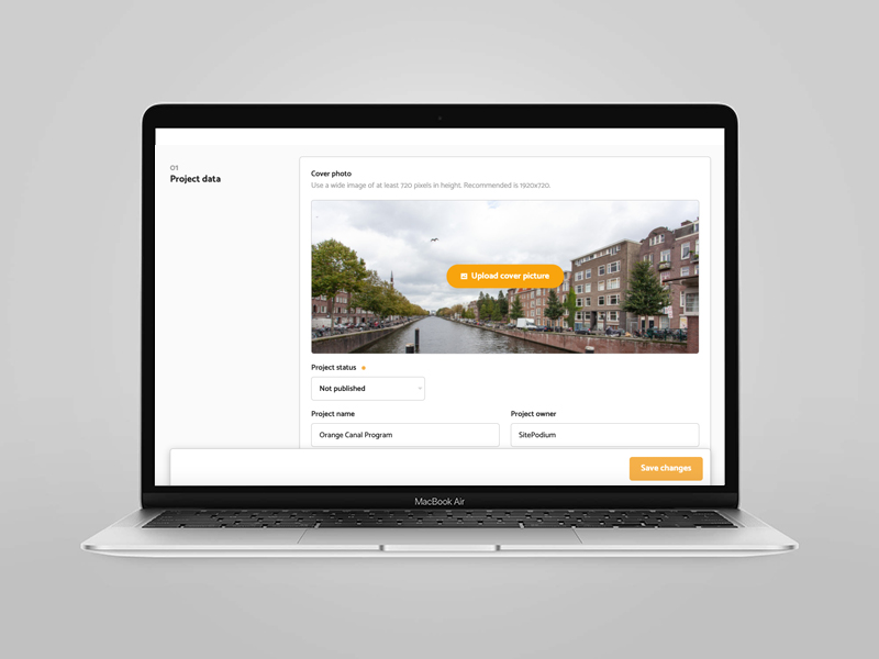
On the ‘General’ management page, the various components are now shown in a more step-by-step fashion. You no longer have to scroll down to save the changes; this button now always remains at the bottom of the screen.
The settings for Conversations are brought together under the tab ‘Conversations’. In addition to that, we have fulfilled a frequently heard wish; namely the ability to enter multiple email addresses that will receive notifications for incoming conversations. This way you can work together with other team members even more efficiently from now on.
A facelift for the Planning page
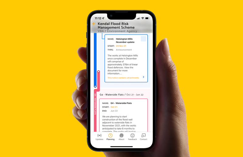
We have also thoroughly overhauled the Planning page. This is not so much about the functionalities, but mainly about its looks. This applies to both the app and the admin portal. Our starting point has been to better visualize the difference between Phases and Announcements. The use of different colors makes the distinction between phases more visible. It is also easier to spot when phases overlap.
In addition to that, a number of changes have been made within Announcements. Instead of just Hindrance, Highlight, Detour or Information, you can now choose Attention, Milestone, Diversion, Announcement, Roadblock, Warning and Inconvenience.
Announcements are now also sided with clear icons in both the app and the admin portal. This makes the planning clearer and easier to understand.
New Project hierarchy: Programs and Projects
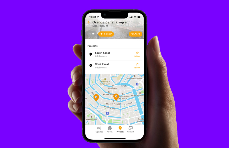
Especially for projects with a program structure, we have made a new hierarchy available in the General Project Management part of our portal. It is now possible to make Projects part of an overarching Program. By adding sub projects to a ‘Project’, a project becomes a ‘Program’. Both in the app and in the admin portal, this structure can be recognized by clear labels. Programs will also get an extra tab with the label ‘Projects’ in the app, so that end users can easily view and follow these sub projects.
Improved email notifications for administrators
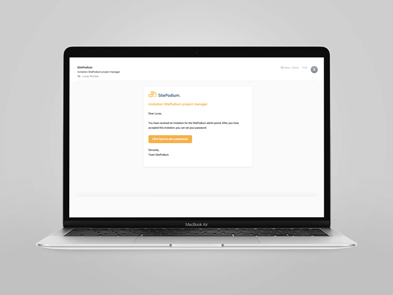
The email notifications for administrators have also been improved visually. They are now a lot nicer looking and equipped with clear action buttons. Inactive administrators receive interim reminders to consider posting a new update for their project.
Translation option ‘About’
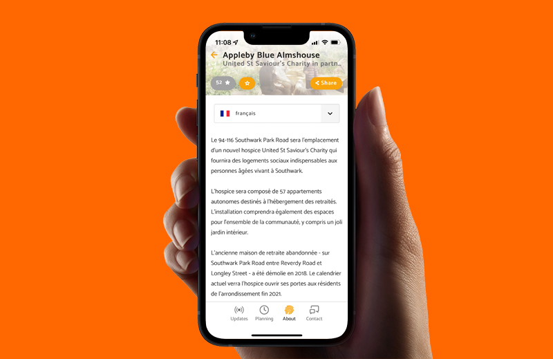
To make the app even more accessible and inclusive, we’ve added a translation option on the ‘About’ page for each project. This makes it possible to automatically translate the text on this page into a number of pre-selected languages. This allows followers who do not master the English language to understand the background of your projects. In a next update, this translation option will also be available in throughout other parts within the app.
