With over 600,000 downloads worldwide to date, a large number of people rely on our platform daily to obtain important project information.
Consequently, we feel a tremendous responsibility to deliver the best possible product on the market. This responsibility extends not only to our clients but also to the thousands of residents, shopkeepers, commuters, and other interested parties who open our app on their phones every day.
Upon opening the new SitePodium App, you will immediately notice a new design. However, there have also been significant changes under the hood. The new SitePodium App is based on the following principles:
- Promoting engagement
- Improving usability
- Introducing an area-specific approach
In this article, you will read about how we have precisely implemented these principles.
Onboarding
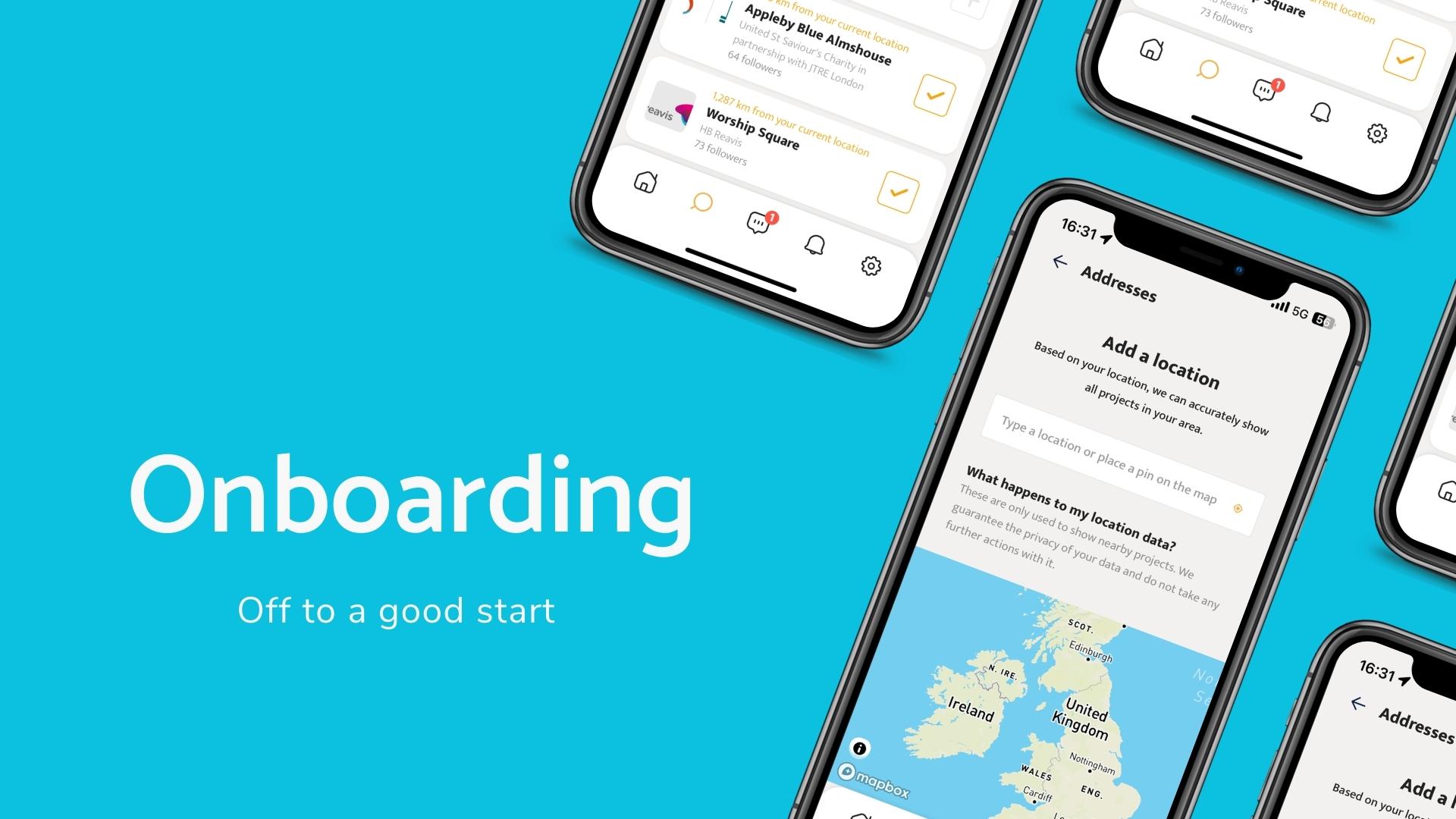
Every day, hundreds of people install the SitePodium App on their phones for the first time. At the same time, the new SitePodium App might also pose a significant change for existing users. Recognizing this, we saw the need to help everyone navigate through the (new) SitePodium App with clear steps.
An important part of this ‘onboarding’ is the addition of locations. This assists users in easily finding and following both current and upcoming projects. In addition to your immediate living area, you can specify your workplace location or sports location, for example.
Home feed
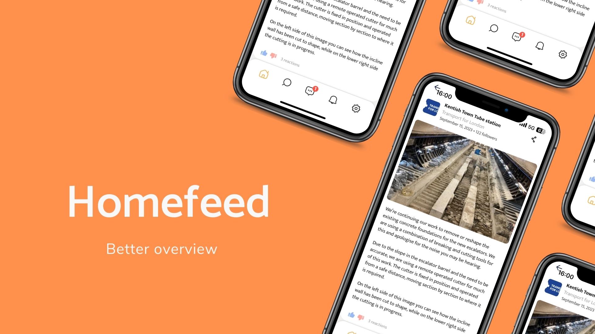
The most significant change in the new SitePodium App is the way updates are displayed. We sought a way to make it easier to follow multiple projects. Instead of a project-specific timeline, we switched to a ‘home feed’. This feed displays updates from all the projects you follow conveniently in one overview. It also occasionally suggests (new) nearby projects.
You can now filter updates as well. These filters are based on the categories you assign to an update in SitePodium’s admin portal. This helps followers create a more organized timeline.
Where previously you could only share photos in updates via social media, you can now share complete updates. This feature enables the easier sharing of important news through other channels.
Participate
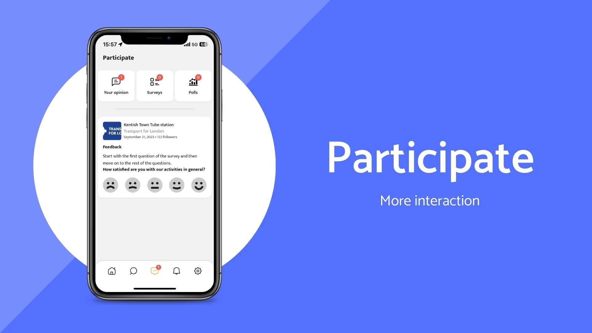
In recent years, Stakeholder Engagement has increasingly evolved into an interactive collaboration between builders and the community. It’s not just about informing people about what you’re going to do but actively involving them in improving the living environment and the way you communicate about it. In practice, we see that consultation and having a say are becoming increasingly important.
The interactive elements were already present. With the feedback monitor, surveys, and polls, we make it easy for every Stakeholder Engagement staff member to gather sentiments and opinions from the community. To increase interaction, we have bundled all these elements and given them a prominent place in the main menu. This encourages SitePodium users to participate more.
The new “Participate” page also aligns with a forward-looking horizon. Behind the scenes, we are busy conceptualizing new features that will make SitePodium even more suitable for participation. With the launch of this page, we are already preparing for these upcoming developments.
Notification Center
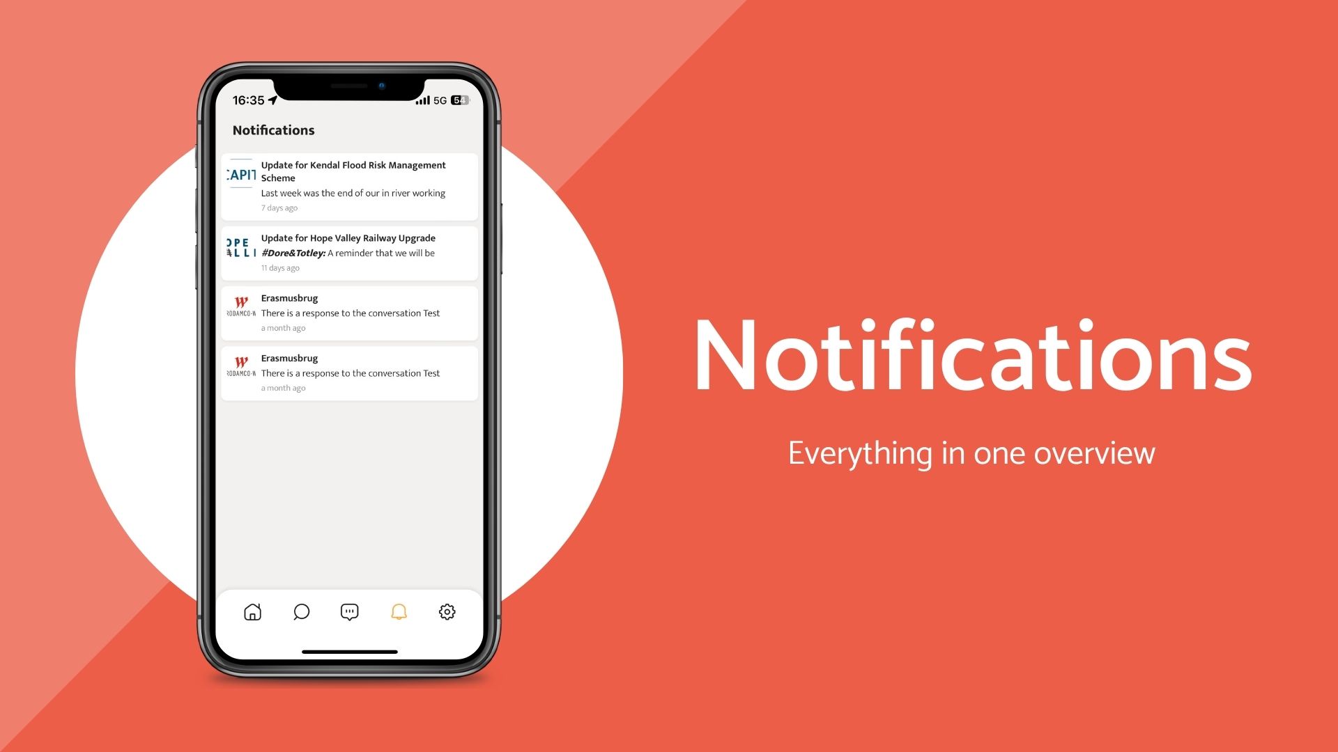
The ability to send push notifications is perhaps the most beloved SitePodium feature. It enables Stakeholder Engagement staff to quickly and easily draw attention to important news. This ensures that the community is always well informed at the right time.
However, what was missing was a clear overview of these push notifications within the App itself. With the new notification center as a permanent component in the main menu, we bring notifications to the forefront for a longer duration.
The redesigned Project Page
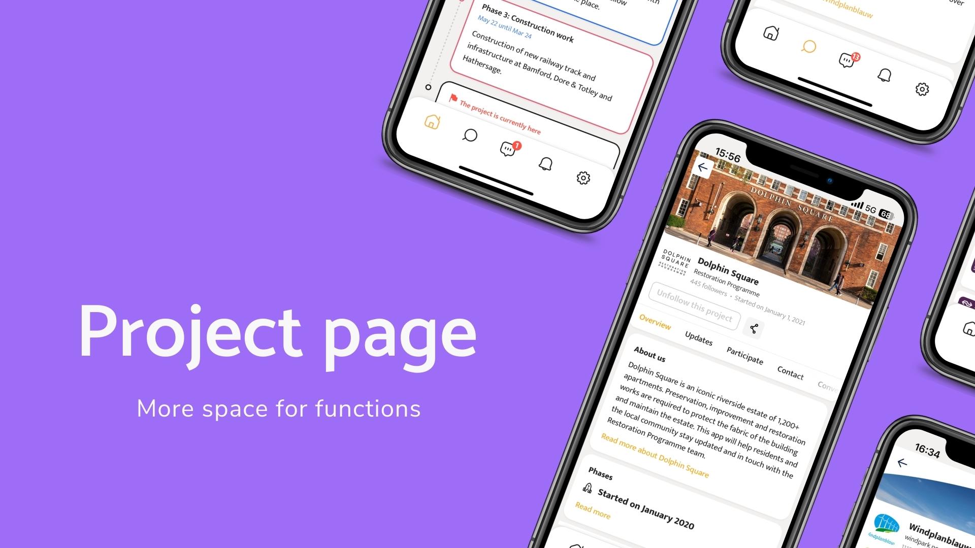
In the new design, the way projects are displayed has also undergone significant changes. The most noticeable change is the project menu, which has been moved from the bottom to the top.
Our primary consideration for this adjustment was to find a functional solution. We were looking for a way to accommodate the continuously growing number of features. The bottom menu was simply too limiting, not only for current functions but also for the ones we plan to add in the future.
When will the new design be available?
In the latest version of the app, there’s already and option to switch between the old and new designs. This allows users and clients to get accustomed to the upcoming changes. The feedback we are receiving helps us improve certain aspects or reconsider certain features. Over the coming weeks, we will fully roll out this new design to all SitePodium users.
Questions or comments?
After reading this article or upon.seeing the new design, you might have questions or comments. Perhaps some things are not functioning the way you’re used to, or you’ve come across something you’d like to report to us. We warmly invite you to reach out to us at info@sitepodium.com
